No, and matching is what makes a room look staged. Pick up one of the rug’s smaller accent colors and let everything else sit slightly apart.
DIY Wall Decor Ideas That Complement Your Rugs, Colors, and Textures
Author
Claire Douglas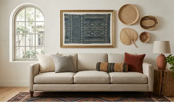
That rug has been on the floor for years. Somewhere in the pile there is a thin line of rust, or olive, or ink blue, that the pattern only uses twice and that nobody has ever looked at directly.
Almost every guide to wall decor starts from an empty room with a fresh budget, which is not the room any of us actually live in. You already own the colors. They are underfoot and on the sofa.
What follows works backwards from what the room already contains — its palette and its materials — to a wall that looks like it was always meant to be there.
Table of Contents:
Read the Rug First
Your floor has mostly made your entire decision of choosing a rug, and most people don’t even realize it. Stand at the door and look down before you look up. The largest single block of colour and pattern in the room sits right there, and it tells you exactly what kind of personality your room will have. A rug that is busy with accents, colours, and patterns has claimed the job of being interesting, but a plain one with only solid colours on it makes the entire room feel more cold and uninteresting.
This is a calculation that takes only ten seconds but can make your whole room feel much more vibrant.
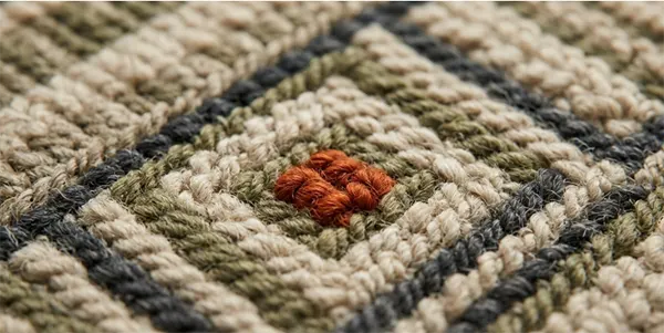
One common mistake that most people make is to use the colour from the rug, which almost covers the entirety of it. Instead, the best approach to create a more suitable setting for your room is to use the colours of the rug that are used in small portions in between the patterns, because those are the ones the eye has already registered without naming. Pull one of those instead of the rug surface colours onto the wall, and the room reads as considered.
Matched is the trap. A cushion, a rug and a print in the same blue looks like a showroom set, and your living space is doing something harder than that.
Borrowing a Palette from the Floor Up
Many people make this one mistake, which costs more time and money than the actual product itself. Most people buy textiles based on the colours and patterns.
While that in itself is not a problem, considering how much light they will reflect back when placed in a normal-size room with normal lighting is an important factor to consider before placing it in your home. For example, a shade that looks rich on a chip in a bright shop turns gray on a north-facing wall in November.
Usually, paint people have a number for this on every colour, and that number specifically describes how much of the light that hits a surface is actually reflected back from it.
Darker tones behave differently depending on where you put them, which is why a deep olive canvas that looks wonderful on the wall facing the window can vanish on the wall beside it. Hence it is always a good option to test the piece in its actual spot, at four in the afternoon, before committing a nail to plaster.
Did you know?
Light Reflectance Value runs from zero, absolute black that absorbs all light, to 100, pure white that reflects all of it. Above 50, a surface bounces back more light than it takes in. Below 50, it soaks up more than it gives.
Texture Is the Part People Skip
Most rugs have two features which make them a perfect centrepiece. The first is colour and the second is texture. While most people fix their attention on colours, it is actually the texture of a rug that actually carries out most of the work. Interestingly enough, it is also the cheaper one of the two.
For example, a wool rug and a jute basket both have different textures, and they both do more for the lighting of a room than any colour. Similarly, flat glossy prints are materials that sit on top of such conversations without joining them. Hang something woven, or slightly uneven, and it starts to belong.
The best trick going at the moment is also the cheapest. Instead of a paper mount behind a framed piece, use fabric. An offcut of the curtain material, or a scrap of something inherited.
This method was also described by the designer Meghana Jay in Good Housekeeping as adding depth to the room. Meghan conveys that framed fabric adds a tactile quality to a room that a flat mount cannot. She even goes on to say that she still has her great-grandmother’s lace on her own wall.
Other things worth making rather than buying:
- Fabrics of upholstery stapled to a frame of timber
- Instead of getting sculptures, one can always hang grouped woven trays
- A length of patterned fabric hemmed top and bottom, hung from a dowel
- Pressed leaves between two panes of glass, picking up a jute or sisal floor
A raw oak moulding beside a wool rug says something quite different from the same image in black aluminium, and any decent picture framing retailer carries timber profiles in enough tones to hold against a rug sample first.
What the Room’s Bones Will Allow
Understanding that every room is different in terms of its lighting, height, or space and hence has to be styled differently is what makes a room feel personal.
| What the room already gives you | What that lets the wall do |
|---|---|
| A patterned rug doing most of the talking | One large quiet piece, or a tight group in a single tone |
| Plain rug, plain upholstery | Pattern, color and mixed frame finishes can all live up there |
| Low ceilings and a long run of wall | Horizontal arrangements, kept well clear of the ceiling line |
| A tall room with a narrow wall | One vertical piece, or a stacked pair hung as a column |
Fixed features win arguments. Ceiling height, window position and the run of unbroken wall between a door frame and a corner make up the interior architecture of a room, and no amount of clever hanging fixes a wall that is simply too short for the piece you fell in love with.
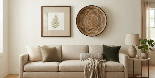
Five things worth checking while you are standing in the room:
- Which wall the afternoon light actually lands on
- The colors your rug uses least
- Whether something you own could be the mount instead of paper
- How much unbroken wall you have, measured rather than guessed
- Whether the floor is already the loudest thing here
When Should a Wall Stay Empty?
The majority of us think that a room has to look busy through patterns or objects in order to look beautiful, but that is hardly ever the case. Sometimes the room is already full, and hanging any more pieces on it just takes from its beauty rather than adding to it.
If a room is already busy, then using a patterned rug, a printed sofa, or a busy curtain will use all the available attention and make it hard for your guest to notice anything in the room at all. Hence, in such cases, having a free wall is not just a lack of creativity; it is actually a designed decision. And the best part is that it is completely free.
Takeaways
When learning to decide how to design your room, one should always follow a course of steps. They should always start with the floor and work their way upwards since the floor is what makes up the majority of the room. Adding rugs, which make the room interesting through patterns or colours, is a good option, although choosing the wall colours based on the colour that your rug uses the most would be a rookie mistake. It is advised to borrow the small colors rather than the obvious ones.
After the colour of the wall and the rug is decided, one should worry about the texture of the pieces that are to be placed in the room, since texture is usually what makes a room feel more elegant and classy. While choosing the texture, one important thing to remember is to make sure which texture and what colour reflects the most light when placed in a room with no big artificial light source.
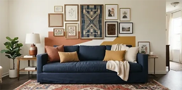
Walls are the last decision and the cheapest to reverse. Rugs and sofas you live with for a decade. A framed offcut costs an afternoon, so make the version you want now and change it when the room does.
Frequently Asked Questions
Should wall art match my rug exactly?
How do I choose a frame color for a room with wooden floors?
Hold the moulding samples against the floor and the rug, not the wall. Raw and mid-toned timbers sit more comfortably alongside wool and jute than black or polished metal does, which tends to read as a hard edge.
Can I really use fabric instead of a photo mount?
Yes, and it is one of the few cheap upgrades left. Cut the fabric larger than the mount board, wrap the edges behind and tape them down before reassembling.
What if my walls are dark?
Then pale mounts read far more strongly, because a dark surface gives very little light back. Keep the artwork’s tone well away from the wall’s.
Sources
gallery wall: Good Housekeeping, The Gallery Wall Reinvented
What is LRV, Diamond Vogel: https://www.diamondvogel.com/architectural/blog/what-is-lrv
Latest Blog